Goldda
An identity built
around possibility.
An identity built
around possibility.
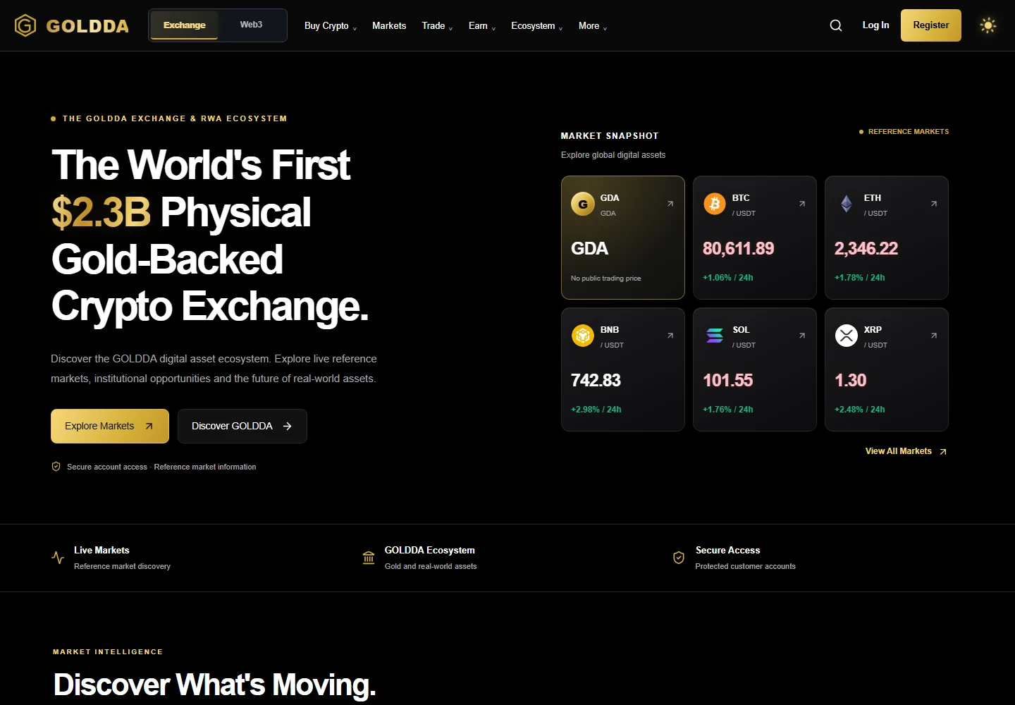
Goldda presents its digital-asset ecosystem through a strong gold-and-black identity. The website connects an expressive opening with market information and dedicated areas for exploring the wider platform.
The design focus: carry a recognisable gold-and-black identity through navigation, market content and the mobile experience.
Our contribution: frontend and backend development.
The interface.
The application behind it.
Frontend and backend development for Goldda’s digital asset ecosystem. Explore the interface and the platform story below.
See the interface in detailDelivered scope: frontend and backend. The images below show the interface.
- Frontend development
- A gold-and-black interface that carries Goldda’s identity across navigation, content and mobile layouts.
- Backend development
- Application development behind the interface, delivered as part of the same project.
- Connected delivery
- Frontend and backend responsibilities brought together within one Obsidian Social engagement.

A digital identity.
Given dimension.
A sculptural interpretation of GDA, connecting Goldda’s gold visual identity to its digital experience.
Illustrative coin design by Obsidian Social. Not official token artwork or a physical product.
One identity. Many touchpoints.
Gold is the recurring visual cue, connecting navigation, calls to action, and market content. Dark backgrounds make those priorities clear while maintaining continuity between sections.
- Colour as a guide. Gold highlights navigation and key actions against dark surfaces.
- Connected sections. Repeated visual cues link the opening and market content.
- Continuity on mobile. The compact layout retains the same visual character.
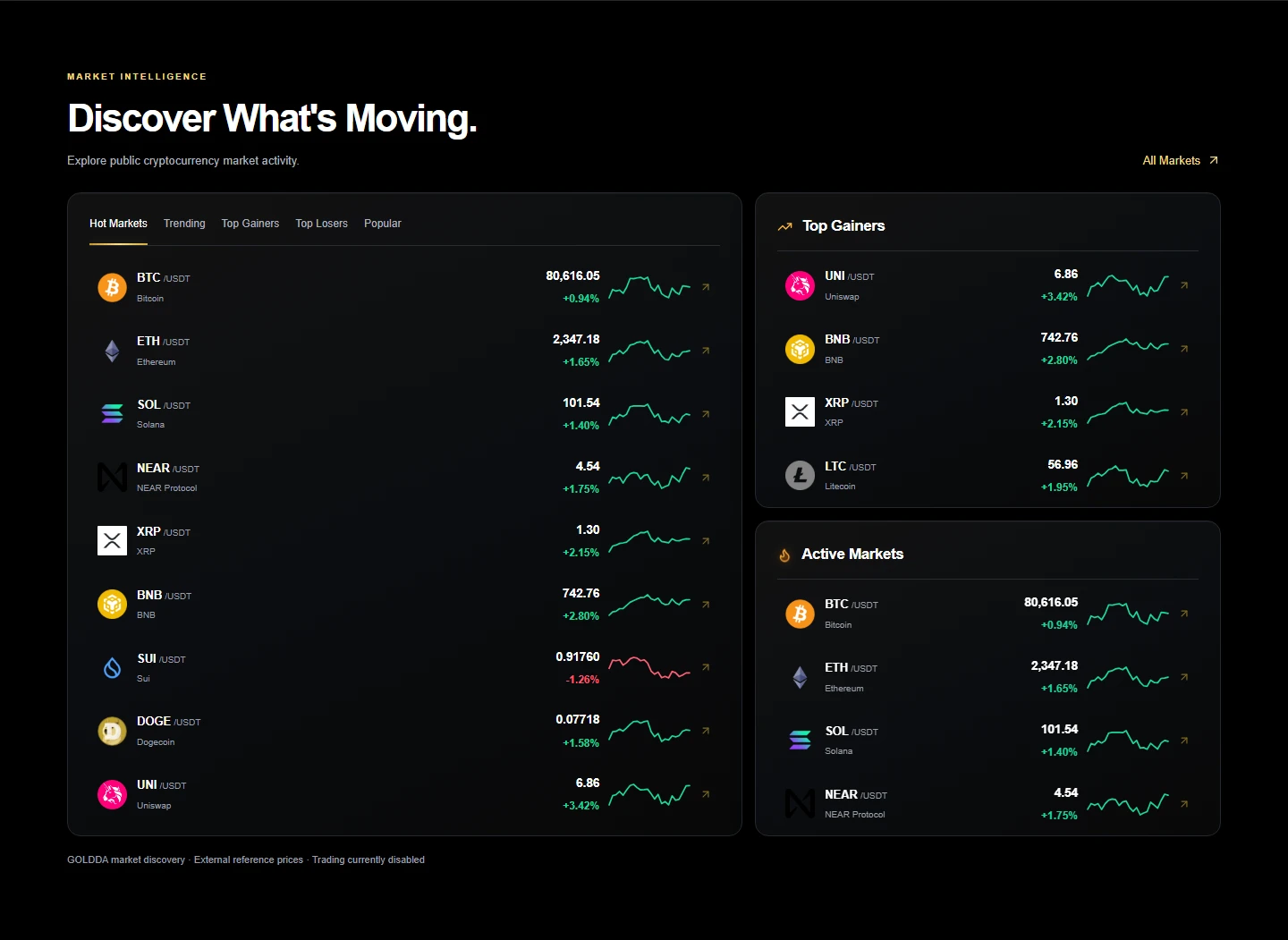
The same character. A smaller canvas.
The mobile presentation gives the content a vertical rhythm, keeping navigation, the opening message, and the primary actions within a narrow viewport.
Explore the website (opens in a new tab)
Have a project
with its own challenges?